Guerrilla Marketing, According to Hubspot
As the primary author of two books in the Guerrilla Marketing series (Guerrilla Marketing to Heal the World and Guerrilla Marketing Goes Green) and a speaker at the recent Guerrilla Marketing Summit, I was very interested in how the digital marketing pioneer Hubspot views the whole Guerrilla Marketing concept and brand.
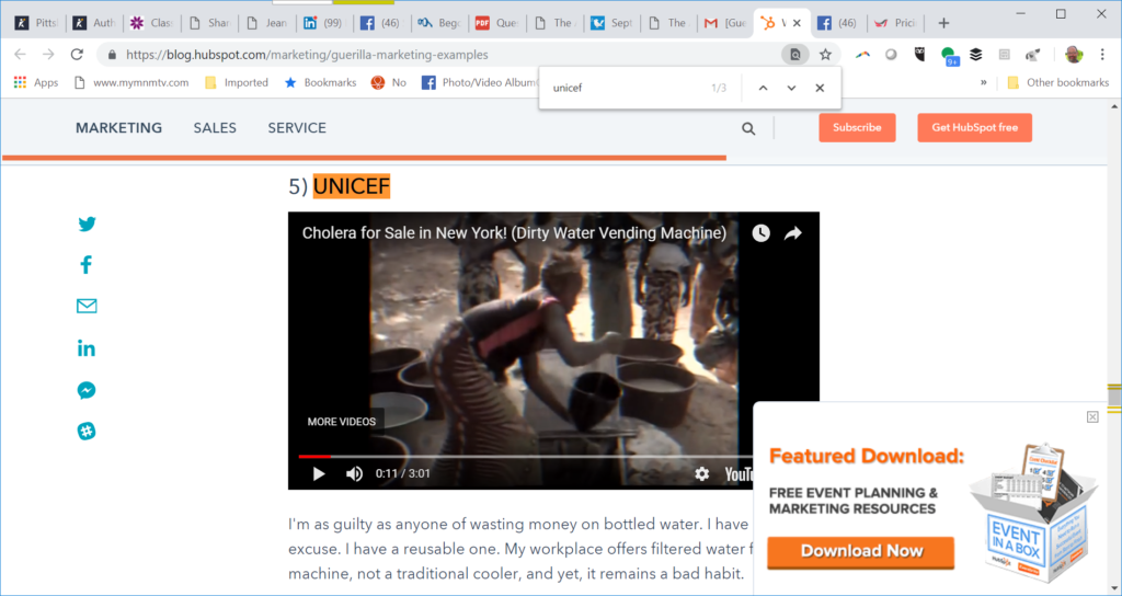
In their seven examples, I was particularly thrilled that they included UNICEF’s super-successful Dirty Water campaign.

After all, my two Guerrilla books are the ones that extend the Guerrilla Marketing concepts to the worlds of social change of environmentalism. This was a bit of a gamble for UNICEF; there were obviously significant costs in everything from developing the branding to shipping the filthy water. I hope they’re replicating the campaign in other cities, and creating strong follow-up messaging targeted specifically to those touched by this campaign, to keep them donating into the future.
My definition of Guerrilla Marketing is a lot broader than Hubspot’s. To me, Guerrilla Marketing has three main parts:
- Being nimble in our thinking and actions, seizing opportunities quickly, including news tie-ins
- Going outside and beyond conventional thinking patterns–disrupting the mental flow to get noticed, to move people to action, but in ways that don’t feel obnoxiously intrusive
- Focusing not on how great your brand is (the mistake I see so many marketers make. I call it “we, we, we all the way home) but on the results: the benefits, the problems solved, the pain relieved, the wants and needs met or exceeded–whether for the individual customer or for the planet and the species that live on it.
Hubspot’s choice of the Bounty sculpture is a beautiful example.
Ideally, Guerrilla Marketing will be done at little cost, too. But, as the UNICEF and Grammy examples show, there are plenty of Guerrilla Marketing opportunities that aren’t necessarily cheap.
Let’s look at those two more closely, because they offer us very different lessons. It will take you exactly three minutes and 40 seconds to watch the two videos. Go ahead; I’ll wait.
UNICEF
This elaborate campaign involved creating a brand, bottling filthy brown water, and offering it on the streets of New York. The goal: to increase awareness that the clean, drinkable water we take for granted in most of the US (and the developed world generally) is unimaginable luxury for people at the margins in developing countries. Many have to drink filthy, disease-causing water, and many get very sick. The campaign encouraged people to use the money they currently spend on bottled water to provide clean water for those who don’t have it. Each dollar could supply a thirsty child for 40 days. The video documents the whole campaign, in a fast-paced three minutes.
I found this very effective. I love the way they were able to not just raise awareness, but funds. The negative branding is definitely a Guerrilla tactic, and the results are clearly positive. Bravo!
Grammy Ad
This was an expensive missed opportunity. Maybe it’s a generational thing, but this one really didn’t work for me. Great concept, but terrible execution. I want the protagonist be moved and touched by what he’s seeing, but he strolls through the talking posters, blithe and indifferent. He’s not even glancing at the posters! What’s going on in HIS head? We don’t even get a hint. Have the talking portraits of Harry Potter and the constant animations of things people didn’t animate in the past made a talking poster no-longer-special? And while my wife frequently accuses me of ADD, I found that I hadn’t even processed and recognized one song before it switched after a few seconds to something else. (And OK, I confess, this was not music I’m familiar with anyway). Some of the problem was that the songs all sounded so similar and all seemed to have the exact same beat.
I also think the choice of having multiple copies of each poster was unfortunate. Yes, I recognize that’s a common way to display posters in urban environments. It has NEVER worked for me. I’ve studied some of the advertising masters like David Ogilvy, and they taught me the importance of white space: of having one central object (or person, animal, tree…) able to stand out from what’s around it, because of that empty space around it. If I were buying billboards, instead of, say, 9 medium-sized repeated pictures, I’d use the space for one much larger version of the image. I’d use that white space and not add to the clutter.
Imagine walking down the street and seeing a 20-foot billboard suddenly start to sing with its one and only mouth! Imagine hearing snippets of three or four songs that each have a clear identity, in a true medley, each sung by one giant poster of an artist you recognize instantly. Would you be as blase as the protagonist? I doubt it!
So maybe the commercial would need a full minute instead of 39 seconds. That’s OK. In print copywriting, it’s perfectly OK to take as much time as you need to tell the story; I’ve seen emails with links to 40-page sales letters. Even in broadcast, even though airtime is expensive, we’ve seen many successful commercials that ran an hour (they’re called infomercials and they run on shopping channels). The UNICEF video was three entire minutes and I watched without multitasking, because I was interested both in their message and how they promoted it. If you can’t get it done in less than a minute, either buy more airtime, or script a commercial that CAN get it done in the time you bought.
