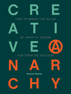
Review of Creative Anarchy: How to Break the Rules of Graphic Design for Creative Success

The book has two key principles. The first is that rules are made to be broken. The second is that in order to break the rules, you must understand them.
For example, a common rule in book publishing is that books have both a front and a back. However, this book has two fronts. The larger, green, side is more or less about the rules. The thinner, red, side is about breaking those rules.
It makes fascinating reading.
However, as someone who occasionally hires graphic artists, I find that I generally insist on two rules that only get lip service here. First, I believe that it is usually important to write copy before considering the design. And secondly, I believe that any visual representation should enhance the message. Some of her examples do this beautifully and creatively, while others left me scratching my head and saying huh?
