Publishers Clearing House—Everything I Despise About Direct Mail, in One Envelope, Part 1
Thanks, I’m guessing, to the no-junk-mail opt-out list, it had been quite a few years since I’d heard from Publishers Clearing House.
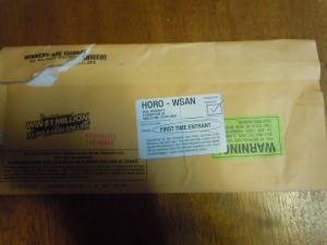
- Front of the envelope from Publishers Clearing House
Yup—Publishers Clearing House. The infamous magazine subscription discounter that used to clutter up my mailbox with screamy hype implying very strongly that I’d won some enormous fortune, if only I followed all the (seemed like) 39 steps to claim it.
The same Publishers Clearing House that once sent a mailer to Dance Spree, a community arts group, boldly announcing, “D. Spree, You May Already Have Won a Million Dollars” in a mailmerge whose dot matrix fonts didn’t match the rest of the offset-printed letter.
On a whim, I decided to open the envelope—not with any intention of entering the latest Publishers Clearing House sweepstakes, but to see if the business world’s shift over the last dozen years or so in the direction of switching off the hype in favor of softer and more ethical marketing approaches—a shift that I like to think I had at least something to do with—had made any impact on Publishers Clearing House, King of the Old-Style Hype.
The quick answer is no. What I received was a smoother, more sophisticated version of the same junk that Publishers Clearing House has been sending for decades.
Here’s some of what I noticed.
- Very high environmental footprint. Not only did the fat envelope contain 42 separate pieces of paper, but several of them are on shiny paper stock that may not have come from trees, contain decals, etc. In other words, the packet will be difficult to recycle.
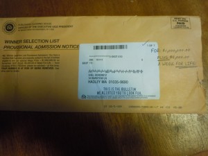
- Improvements in printing technology are noticeable. The customized portions were done on a very high-quality digital printer that looks almost as good as offset. No more hideous dot-matrix mailmerge—except that on the mailing address “label” (you’ll understand the quote marks in a moment), there’s some all-caps text meant to simulate a hand-typed look, reading “THIS IS THE BULLETIN WE ALERTED YOU TO LOOK FOR”

- Disguises and subterfuge. If you give it a casual look, you might think the envelope had three added-on labels (one of them crooked and another upside down), two checkmarks, a note, and a circle in pen, the aforementioned hand-typed-look message, and both black and red rubber stamp imprints. But actually, as far as I can tell, all the various items on the envelope designed to create a feeling that a human being prepared it individually are actually printed on. You’ll also see phrases scattered throughout the mailing, like “prize patrol,” once again designed to convey the impression that a human being is out there, trying to match you up with your winnings. Most people won’t be looking so carefully, of course—but we are not stupid, and I’m betting only a very tiny percentage will think any part of this is actually hand-prepared.
To be continued tomorrow (including a deeper look at the psychology they’re using, and why I discount it).

