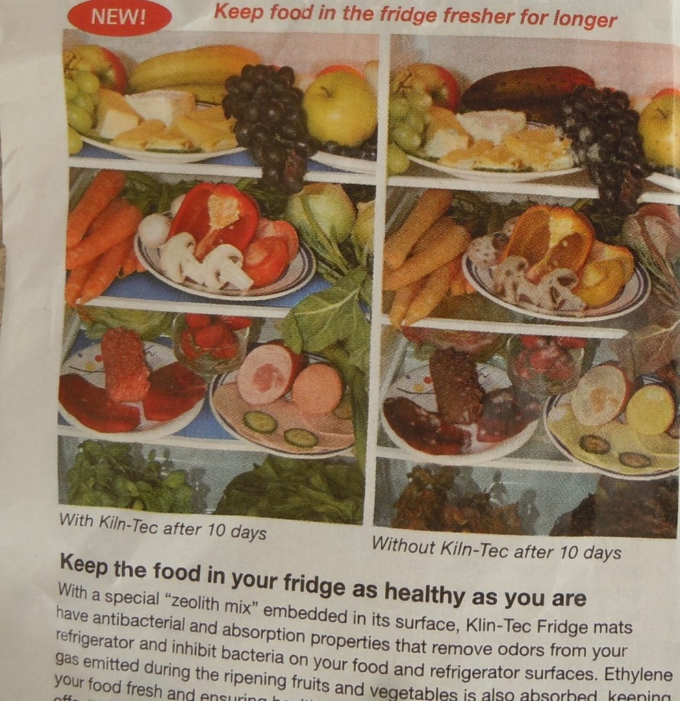
What do you notice about the two images in this photo?

Deceptive comparison ad

Here’s what I notice; the placement and composition of the vegetables and fruits are exactly the same. Look at the carrots, for instance. It is statistically impossible to pose a bunch of carrots in exactly the same alignment for two pictures taken at different times, and just as impossible to find two different bunches of carrots where each carrot has exactly the same shape as one in the other batch and are in the same order. It’s somewhat easier with mushrooms and peppers, but still highly questionable.

What this tells me is that one of two things happened, neither of which are OK if you’re an honest marketer:

1. The same photo was used as the basis for both images. At least one of them was retouched to change the colors, probably the didn’t-use-it one, which also had believability-enhancing touches like aging in the mold on the grapes.

OR

2. The advertising agency took the first photo, and then left the fridge untouched for some period of time, and came back and took the aged picture.

Either way, just like the food in the aged picture, it doesn’t pass the sniff test. The ad claims that these were different batches of food and implies that they were subjected to a scientific comparison. That would mean two different sets of vegetables aging in different but calibrated refrigerators for the same time, one with the treatment and one without (or the same refrigerator used to test each batch one at a time, starting with the untreated one to avoid tainting the results). I do not see any evidence in this photo that this is what happened.

Chose your own term: false advertising, deceptive advertising, misleading advertising—whatever you choose to call it, it’s certainly a major ethical violation and quite possibly a violation of truth in advertising laws such as Section 43(a)(1)(A) of the Lanham Act.

And therefore, I don’t believe the ad. And therefore, I don’t trust anything else in the catalog where I found it (an in-flight sky mall). And therefore, this entire catalog loses any chance of getting me as a customer, forever. And therefore, I am sharing my perception that this company engages in deceptive practices. Perhaps this post could even go viral and be seen by thousands or millions of people.

So on a practical as well as a moral level, this deceptive advertising practice backfired. Big time. My question to the ad agency and to the people at the client who approved it (who may, in fairness, not have realized the ad was deceptive): was it worth it? This catalog company should fire its ad agency for engaging in false advertising, and should look with a critical eye at every other bit of advertising this agency prepared.

And if you’re a marketer, take a look at your own marketing. Have you accidentally or deliberately engaged in similar false advertising practices? Are you aware that one demonstrable lie can ruin a long-built reputation for integrity if anyone publicly calls you out for deceptive advertising in the press or in social media?

Facebooktwitterpinterestlinkedinmail

(continued from yesterday)

Scary warnings and official-looking documents from Publishers Clearing House
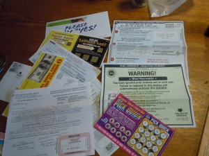
  • Publishers Clearing House still believes in direct mail that scares people into action. The envelope and packet are full of legal-looking documents, dire warnings in big bold print, etc.
  • The “involvement devices”—labels to pull off and attach, gold-covered panels to scratch off, very complicated instructions to follow exactly—are variations on the same stuff I remember from Publishers Clearing House mailers in the 1970s and 1980s. And they were old and tired even back then.
  • Publishers Clearing House apparently never got the memo on credibility in marketing. Instead of using real credibility builders such as testimonials, they fill the mailing with official-looking layouts, fake stickers with bar codes, and language on the return form with language like “I am claiming eligibility…” Oh yes, and they’re still using celebrities, as they used the late Ed McMahon for many years (in fact, I first heard of Ed McMahon through PCH sweepstakes, and had to find out later that he was a TV star). Now, it’s Brian Williams.

Back in 2000, the PCH sweepstakes mailings inspired this quote in the Direct Mail section of my earlier book, Grassroots Marketing: Getting Noticed in a Noisy World:

Forget about glitzy, complicated sweepstakes offers, with seemingly dozens of different-sized papers, foils, stickers, and scratch-off cards; your production cost will be enormous before you even start. Besides, they cost you tons of money mailing to and following up on false prospects.

A simple, straightforward approach is far better. Use ordinary paper sizes and stocks, and win the prospect over through the strength of your offer—not gimmicks or packaging. You’ll stay within your budget, and target serious prospects, not a bunch of chiselers hoping for a million dollars from you, Ed McMahon, or the tooth fairy.

That was true when I wrote Grassroots Marketing, and even more true now.

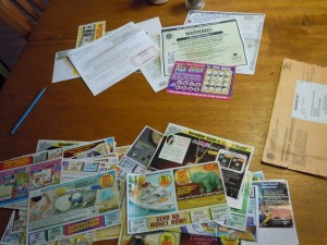
PCH sweepstakes-related inserts vs. ad delivery from other companies
Publishers Clearing House sweepstakes-related inserts vs. ad delivery from other companies
  • Of the 44 pieces of paper in the envelope, only 9-1/2 were actually related to the PCH sweepstakes and offer. The others, including the back of one of the Publishers Clearing House pages, were ads from other companies. Given that so much magazine content is available online, for free, that a whole generation will barely pick up a paper magazine any more, and that numerous other channels provide the information we used to get from general-interest magazines, it makes sense that Publishers Clearing House realized its business model had to change. Now they’re apparently in the business of delivering cheesy offers from other merchants—what could have been a good use of the partnership strategy I advocate, if the offer quality and targeting hadn’t been so pathetic.
  • Geotargeting has become more sophisticated. One of the slips announces “SHEL HOROWITZ, THE SEARCH FOR A MAJOR PRIZE WINNER IN THE SPRINGFIELD-HOLYOKE TV AREA INCLUDES YOUR 01035 NEIGHBORHOOD!… There will DEFINITELY be a   Major Prize Winner of $1,000.00 from Your Local TV Area, which includes your Zip Code!” (capitalization, punctuation, and underlining are exactly as they were in the original). So Publishers Clearing House is now matching zip codes against media markets, and guaranteeing at least one winner—note the SMALL dollar amount—in my media market (which contains dozens of zip codes).
  • Technology isn’t perfect. My envelope contained two copies of a several-page ad bundle (one of several in the mailing)—and DID NOT contain the actual form to select magazines! Even if I’d wanted to subscribe, I couldn’t do so from this mailing.

I may get an onslaught of comments pointing out that Publishers Clearing House’s methods are obviously working, or they wouldn’t keep at it after all these decades. Of course they work! I freely grant that.

But to what effect? What’s the real benefit of developing a large list of purely transactional contacts who didn’t necessarily even buy—they entered a chance to win big bucks for free. Do these people have any loyalty? Has PCH done any segmentation other than geographic? Can they market to these people as individuals in any meaningful way?

The negative answer is obvious in the kinds of junk offers crammed into the rest of the PCH sweepstakes envelope: tchatchkes and trinkets and home repair products of dubious value—the sort of stuff that gets sold on late-night TV ads over obscure cable channels. It’s these clueless merchants that I actually feel sorry for.

Facebooktwitterpinterestlinkedinmail

Thanks, I’m guessing, to the no-junk-mail opt-out list, it had been quite a few years since I’d heard from Publishers Clearing House.

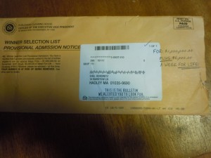
Front of the envelope from Publishers Clearing House

Front of the envelope from Publishers Clearing House

Yup—Publishers Clearing House. The infamous magazine subscription discounter that used to clutter up my mailbox with screamy hype implying very strongly that I’d won some enormous fortune, if only I followed all the (seemed like) 39 steps to claim it.

The same Publishers Clearing House that once sent a mailer to Dance Spree, a community arts group, boldly announcing, “D. Spree, You May Already Have Won a Million Dollars” in a mailmerge whose dot matrix fonts didn’t match the rest of the offset-printed letter.

On a whim, I decided to open the envelope—not with any intention of entering the latest Publishers Clearing House sweepstakes, but to see if the business world’s shift over the last dozen years or so in the direction of switching off the hype in favor of softer and more ethical marketing approaches—a shift that I like to think I had at least something to do with—had made any impact on Publishers Clearing House, King of the Old-Style Hype.

The quick answer is no. What I received was a smoother, more sophisticated version of the same junk that Publishers Clearing House has been sending for decades.

Here’s some of what I noticed.

  • Very high environmental footprint. Not only did the fat envelope contain 42 separate pieces of paper, but several of them are on shiny paper stock that may not have come from trees, contain decals, etc. In other words, the packet will be difficult to recycle.
  • Improvements in printing technology are noticeable. The customized portions were done on a very high-quality digital printer that looks almost as good as offset. No more hideous dot-matrix mailmerge—except that on the mailing address “label” (you’ll understand the quote marks in a moment), there’s some all-caps text meant to simulate a hand-typed look, reading “THIS IS THE BULLETIN WE ALERTED YOU TO LOOK FOR”
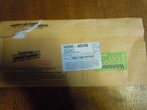
Rear of the envelope from Publishers Clearing House


  • Disguises and subterfuge. If you give it a casual look, you might think the envelope had three added-on labels (one of them crooked and another upside down), two checkmarks, a note, and a circle in pen, the aforementioned hand-typed-look message, and both black and red rubber stamp imprints. But actually, as far as I can tell, all the various items on the envelope designed to create a feeling that a human being prepared it individually are actually printed on. You’ll also see phrases scattered throughout the mailing, like “prize patrol,” once again designed to convey the impression that a human being is out there, trying to match you up with your winnings. Most people won’t be looking so carefully, of course—but we are not stupid, and I’m betting only a very tiny percentage will think any part of this is actually hand-prepared.

To be continued tomorrow (including a deeper look at the psychology they’re using, and why I discount it).

Facebooktwitterpinterestlinkedinmail

Guest Post by Marcia Yudkin, Marketing Expert and Mentor

“Does my idea reinforce what people already believe, or does
it challenge them?” writes Adrian Alexander in a description
of criteria he uses when looking for thought nuggets that
can get people talking and caring.

Although he looks for the element that he calls “high
tension” to select the ideas he develops into ads, you can
use it as a tool for identifying powerful headlines, subject
lines, book titles or press release themes. Indeed,
Alexander tests a promising idea by writing a fake press
release about it “to see if it’ll create buzz. Is it worth
the paper it’s written on? This helps me call BS on
myself,” he says.

To achieve a highly charged degree of tension, you need to
contradict a cherished belief, create unlikely
juxtapositions, relabel something familiar or shift the
context of a common conversation.

Adds Alexander, who is quoted in the book The Creative
Process Illustrated, “Great ideas don’t need mass
communication to be heard. Ideas, if they’re big enough,
diffuse through culture organically and can infiltrate
hearts, minds and culture as a whole.”

Marcia Yudkin mentors marketers who hope to spread the word about their ideas, talents and inventions. Her upcoming Kindle Jumpstart Course offers step-by-step guidance for publishing on Amazon’s Kindle(www.yudkin.com/kindle.htm). This post originally appeared in her Marketing Minute newsletter (which I’ve been reading for many years), and is used with her permission.

Facebooktwitterpinterestlinkedinmail

Yet another company has gotten in trouble for greenwashing. Raz Godelnik writes in Triple Pundit about cereal giant General Mills’ legal woes: multiple lawsuits over deceptive packaging, claiming for example that its Nature Valley brand of granola bars is “all natural” when in fact it’s highly processed and contains such ingredients as maltodextrin.

You’d think by now companies woud have caught on that honesty really is the best policy.

Of course, it would be nice if the word “natural” actually had a legal definition, and thus some teeth. But it would also be nice if a company that claims to be strongly guided by ethics would do a better job of walking its talk.

Facebooktwitterpinterestlinkedinmail

Hands down, my favorite commercial of the Olympics so far–and in fact my favorite TV commercial of the last several years, in any context–is Nike’s “Find Your Greatness: Jogger” (The full transcript,and the one-minute video, are at that link.)

The entire video is an overweight kid running at the camera, starting quite some distance out. Working hard, but not being fazed.

When I saw it on TV, I thought it was an  60-something overweight man. Looking again, I see it’s a kid. But the message of empowerment is the same.

Especially when the voiceover says (in part),

Somehow we’ve come to believe that greatness is a gift reserved for a chosen few, for prodigies, for superstars, and the rest of us can only stand by watching.

You can forget that.

Greatness is not some rare DNA strand, not some precious thing. Greatness is no more unique to us than breathing.

As a somewhat overweight guy who will be 60 in five years–and who has lost 15 pounds since upping my daily exercise regime from 30 to 60 minutes, to 60 to 120 minutes. The ad resonates with me. And not a lot of ads do.


Facebooktwitterpinterestlinkedinmail

Just found this great article on traditional, marketer-driven outbound (“push”) marketing versus consumer-driven inbound (“pull”) marketing—and it had a really good insight I want to share with you:

Whereas outbound marketing often provided consumers with fantasies (think of Budweiser commercials or luxury car ads,) inbound marketing provides consumers with facts. People aren’t researching and gathering information on what fantasy a company is trying to sell them on, they are researching the efficacy of their products, and (with ever-growing regularity) the social and environmental policies of specific brands.

If you’ve followed me for a while, you know that I’m a huge believer in pull marketing, in putting the consumer in the driver’s seat to actively seek out solutions and find you. All the way back in 1985, when I published my first marketing book, I talked about effective Yellow Pages presence. Yellow Pages was the web browser of its time, a way to seek out and compare all the providers of a service and make a decision based on who could serve you best. By the time I did my most recent (sixth) marketing book, the award-winning and category-best-selling Guerrilla Marketing Goes Green, I devoted significant space to inbound/pull strategies, from social media to Internet discussion groups. This kind of marketing is not at all intrusive; in fact, it’s welcomed.

But the insight that the reason it works so well is that it’s based in fact rather than fantasy is something I’ve never articulated. And I find it particularly interesting because the common marketing wisdom is that emotions do the selling, and intellect serves only to justify the purchase to others. I’ve never believed that; I have said for years that the best selling uses both emotion and rationality, complementing each other. To put it another way, selling is much easier when the buyer has both the need and the desire. Either one by itself is rarely enough to close a purchase.

By coincidence, I’m reading a book right now that says businesses don’t need to advertise—but it makes a huge exception for directory listings (including Yellow Pages and search engine ads). I was having trouble with that differentiation, until I read this article. Now I finally understand what the authors are getting at: advertising = fantasy, while listings = fact.

I’m not sure I agree, but at least now I see where they’re coming from.

What do you think—and feel—about this? Please share below.

Facebooktwitterpinterestlinkedinmail

When making any marketing purchase, you want to know what it will bring you. Too many business owners forget that step, and buy blindly, wasting a ton of money.

This morning, I got a call from a promotional products salesman that illustrates this all-too-well. This a  real conversation, as best as I can transcribe it from memory:

Me: I don’t do advertising specialties, because I don’t even meet most of my clients. I get them from my books, from online networking, from my speeches…

Salesman: Would you like more traffic to your website? We do these beautiful laser-engraved pens with your website URL.

Me: I already get about 50,000 visits a month to my site.

Salesman: Well, imagine hundreds of thousands more visitors.


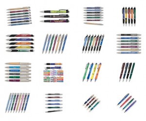
Pens with URLs no one will type in
Would you type in a URL from these pens?

Me: You think I’m going to get hundreds of thousands of visitors by giving out pens? Let me ask you—when was the last time you visited a website because someone gave you a pen with the URL?

Salesman: Most of the pens I’ve seen don’t have URLs.

Me: Well, I’ve seen plenty that do. I read every printed pen I get. And I can’t think of a single one that got me to type in the URL.

First of all, the guy is out of touch. URLs have been appearing on pens for years. I did a quick survey of ten random custom pens in my stash; half had a URL, and some of the others, like a pen from Hyatt hotels, didn’t really need one because the URL is obvious. If you’re going to do any kind of promotional product, you want your URL nice and prominent on it. And second, he was so completely clueless about the ROI for me. The ROI for him is obvious: a commission. But what’s the benefit to me? Zero.

Mind you, I’m not dissing the category of promotional items. I’ve seen examples that work well: an auto sunshade with huge block letters on both sides, promoting a mayoral candidate (she won)…a mug that stays on your desk as a reminder, month after month, a solar calculator promoting a solar energy consultant…lawn signs with the silhouette of the mountain a local environmental group was trying to save, along with both phone and URL (they won).

In fact, I’m actually planning to experiment with a small run of imprinted seed packages; I believe they will harmonize with my message of business growth through green principles. I’ll hand these out when I speak at green business conferences, and maybe throw a few out to the audience for answering questions correctly in general business conferences.

Promotional products make sense when there’s not only a good fit between the marketing vehicle and the brand, but also a good fit between the utility of the product and the visibility of the marketing message. On that last, it’s the difference between items like pens or worse, sunglasses, where the marketing message is hard to read and too small to do much branding anyway—and something that actually might be useful for marketing, say, a t-shirt or tote bag, where the message can easily attract attention.

What are some of the best and worst marketing purchases you’ve made (or seen), from an ROI perspective? Comment below.

Facebooktwitterpinterestlinkedinmail

A blogger on Sustainable Business, Marc Stoiber, wonders why a major sustainability milestone achieved by Translink, the Vancouver, British Colombia transit system, went almost unnoticed by local and national media.

The funny thing is…transit systems control their own media, one that reaches the two most important audiences they have. If I were the company’s marketing director, I’d put inside placards on the front and back of both sides of every bus and subway (four signs in each car) to reach the actual riders—and exterior signage to reach the next-most-important constituency: Vancouver-area residents not yet using public transit.

The interior placards would not just brag about the accomplishment—they’d say thank you to the riders for their part. And those exterior signs would recruit new riders to join the tribe, e.g., “become part of the greenest commute in North America.” And I’d supplement this with a nice social media campaign, which itself could be a subject for exciting press releases, etc.

Then, the local media and perhaps the national media would almost certainly pick up the story—but even if they didn’t, the message would be out there, and if done right, ridership would grow.

Stoiber goes on to discuss the very creative marketing of another transit advocate, Jason Roberts—who put up a website for the a nonexistent light-rail transit line in Dallas, Texas called the Oak Cliff Transit Authority—and was able to organize so effectively around this public vision that the project actually got funded! You might call Roberts’ story “If You Dream It, They Will Come—IF You’re a Marketer and Organizer Who Can Create and Gather a Tribe.”

Vancouver Transit execs: I’d love to consult with you on how to build big awareness. I already have one Vancouver-based green company as a client.

Facebooktwitterpinterestlinkedinmail

Yesterday, I blogged about the combination of vision, engineering, and marketing that made Apple and some other companies so successful. And for years, I’ve been a champion of putting reasons in your marketing.

This TED talk by Simon Sinek goes a step farther. Again using Apple as an example, he says it’s not enough merely to include the because; you want to lead with it. If you put your reasons why—your higher purpose—right at the top you immediately attract the people who are falling-all-over-themselves-eager to be part of your dream and your mission. This, he says, is why we don’t buy MP3 players or tablets from companies like Dell, but we salivate at Apple’s every product release—because Apple leads (and has led, since at least the original Macintosh introduction in 1984) with the deeper why.

Another of his examples is Martin Luther King, Jr.’s “I Have a Dream” speech; King, he notes, did not say, “I have a plan.”

However, King’s speech actually had a bit of a slow build. The first 351 words (of 881, total) are about the plight of black people in this country from the Emancipation Proclamation to the day 100 years later when he gave his speech. Only then, more than a third of the way into his speech, does he move into his vision of the race-neutral future.

Still, I think Sinek is right—but I think it also has to hit on the benefits to the individual, unless you’re speaking only to the driven. I’ve often used this technique in my copywriting without consciously thinking about it. From now on, I will do it consciously.

Facebooktwitterpinterestlinkedinmail