Nostalgiawashing: pretending that you represent the “good old days” of small-town, small-business artisanship while actually running a large, highly mechanized operation.

Although I just invented the term (zero relevant hits on Google), nostalgiawashing’s been a thing for decades. Think about Jack Daniels or Pepperidge Farm. Or nostalgia-driven experience-based companies like Cracker Barrell and even Disney. (Disney is a bit schizophrenic on this, because it markets both nostalgia (for example, Main Street, USA) and its opposite, which I’ll call “tomorrowism” (for example, Epcot). All these companies try to bring us back to a simpler era, when nearly all the figures of authority were straight, white, middle-aged, able-bodied Christian men, and when the upper class could mostly avoid contact with the “masses yearning to breathe free”: immigrants and locally-born alike in the lower classes. Of course, that era never actually existed!

I’m not going on the warpath to eliminate nostalgia-based marketing, even when I think it’s deceptive enough to be called nostalgiawashing. But at least don”t insult our intelligence with it!

This is inspired by a mailing that did insult my intelligence. It was a card that offered “warm winter wishes” on the outside and then offered me a discount on replacement windows and “one of my favorite holiday recipes” (included on a separate index card). I have been a customer, getting replacement patio doors from them a few years ago, so I’ll give them credit for at least keeping in contact. Here’s why it didn’t work:Four-piece mailing from the window company
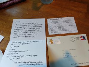
  • The envelope used a very nice handwriting font, but a return address sticker without a name, just an address…a first-class presort stamp and a sprayed-on barcode. It wasn’t difficult to figure out that this was bulk mail, though I thought it was from a charity.
  • The card is in a different handwriting font, even though it purports to be from the same person who addressed it. And they even positioned the text so it slants up the page–but uniformly on every line??? Come on, people, do you really think you’re fooling anyone?
  • I understand why the recipe card, on what pretends to be an old-fashioned index card, uses yet a third handwriting font–because, of course, the manager’s “Aunt Amy” wrote it. But at the end of the second side (not shown), it has a copyright notice in the name of the company. And the recipe itself is something I personally found disgusting. I can’t imagine wanting to make a dessert out of a whole sleeve of saltines, and Heath bar bits.

Of course, I don’t happen to be in the market for new windows anyway. Even if the mailer had been brilliant, I don’t need what they’re selling. But if they were a client of mine, I would have not only used a completely different approach, but recognized that not a lot of previous customers necessarily need four more windows right now and provided incentives for referrals.


Facebooktwitterpinterestlinkedinmail

What do you notice about the two images in this photo?

Deceptive comparison ad

Here’s what I notice; the placement and composition of the vegetables and fruits are exactly the same. Look at the carrots, for instance. It is statistically impossible to pose a bunch of carrots in exactly the same alignment for two pictures taken at different times, and just as impossible to find two different bunches of carrots where each carrot has exactly the same shape as one in the other batch and are in the same order. It’s somewhat easier with mushrooms and peppers, but still highly questionable.

What this tells me is that one of two things happened, neither of which are OK if you’re an honest marketer:

1. The same photo was used as the basis for both images. At least one of them was retouched to change the colors, probably the didn’t-use-it one, which also had believability-enhancing touches like aging in the mold on the grapes.

OR

2. The advertising agency took the first photo, and then left the fridge untouched for some period of time, and came back and took the aged picture.

Either way, just like the food in the aged picture, it doesn’t pass the sniff test. The ad claims that these were different batches of food and implies that they were subjected to a scientific comparison. That would mean two different sets of vegetables aging in different but calibrated refrigerators for the same time, one with the treatment and one without (or the same refrigerator used to test each batch one at a time, starting with the untreated one to avoid tainting the results). I do not see any evidence in this photo that this is what happened.

Chose your own term: false advertising, deceptive advertising, misleading advertising—whatever you choose to call it, it’s certainly a major ethical violation and quite possibly a violation of truth in advertising laws such as Section 43(a)(1)(A) of the Lanham Act.

And therefore, I don’t believe the ad. And therefore, I don’t trust anything else in the catalog where I found it (an in-flight sky mall). And therefore, this entire catalog loses any chance of getting me as a customer, forever. And therefore, I am sharing my perception that this company engages in deceptive practices. Perhaps this post could even go viral and be seen by thousands or millions of people.

So on a practical as well as a moral level, this deceptive advertising practice backfired. Big time. My question to the ad agency and to the people at the client who approved it (who may, in fairness, not have realized the ad was deceptive): was it worth it? This catalog company should fire its ad agency for engaging in false advertising, and should look with a critical eye at every other bit of advertising this agency prepared.

And if you’re a marketer, take a look at your own marketing. Have you accidentally or deliberately engaged in similar false advertising practices? Are you aware that one demonstrable lie can ruin a long-built reputation for integrity if anyone publicly calls you out for deceptive advertising in the press or in social media?Facebooktwitterpinterestlinkedinmail